About Me
Hi, I'm Mateo
I'm a designer. Usually that means asking uncomfortable questions until something gets simpler.
Most of my job is noticing what everyone agreed not to mention.
What if cursors told time? What if keeping a portfolio updated wasn't so hard? What if I stopped waiting for perfect and just shipped things?
Twenty years in. Between roles, open to what's next.
I build things on the side
To stay curious, and because the alternative is rust. No startups, no audiences, no roadmap. Some are useful. Some are just weird. All of them taught me something.
Find me elsewhere
Some things I've made
Chanchán: What if you wrote a song the way you hum it?
Writing down a beat means learning notation first. Most people can already sing it: pum pa pum pa.
Chanchán plays what you type. Drums, bass and chords are lines of plain Spanish, and the sheet of text is the whole song, so sending the link sends the song.
Va: What if sending money felt like using a calculator?
Every banking app makes me pick an account before it'll let me say what I'm doing. That's backwards. You start with how much.
Va (as in "la plata va y viene", money comes and goes) puts the amount first. Type what you're sending, pick who gets it, confirm with Face ID. Three taps. Every traditional banking flow compressed into one screen. The app connects to your bank accounts through an aggregator API and moves real money between them.
No balance displays. No transaction graphs. No feature creep. Just a calculator that happens to move money.
I'm still testing whether this actually works better or if I've over-simplified.

Stow: What if you could bring your own tab bar?
Browsers want to own your tabs. Switch from Chrome to Safari and your "important reading" pile becomes inaccessible.
Stow is a workspace-based bookmark manager. Tabs live in workspaces you carry across browsers and machines. Open a workspace and the right set of tabs lands wherever you are. The browser hosts them; it doesn't own them.
Avis: What if 'this one' wasn't ambiguous?
Telling Claude "make this button bigger" doesn't say which button. You end up describing rectangles like a court witness.
Avis lets you point at elements on a webpage. Claude Code reads the annotation in context: the actual node, its surroundings, the page state. Built on perch, a small AppleScript/JXA driver for Chrome and Safari that does the pointing-at-pixels part.
Figma-CDP: What if your repo had a digital twin?
I got tired of inheriting Figma files that lied about what shipped. Components moved on, the canvas didn't, and the next designer started from fiction.
Figma-CDP is a Claude Code skill that drives Figma over the Chrome DevTools Protocol. Claude reads your code, opens the file, and updates frames to match. The canvas catches up to the build instead of describing what it used to be.
Murmur: What if voice chat was weirder?
I wanted push-to-talk that didn't need accounts or a server. Murmur.
Dirpad: What if you could swipe to navigate the terminal?
fzf, autocomplete, file pickers, vim. Every fast-CLI workflow eventually becomes "press the arrow key 47 times." Your trackpad is sitting there with way more bandwidth than four keys.
Dirpad maps trackpad gestures to arrow keys at the OS level. Swipe down a list of matches in fzf at the speed of a flick. The trackpad already knows how to be fast. Dirpad just lets it talk to apps in a language they already speak.
When: What if movies found you instead?
I got tired of checking if the thing I wanted was out yet. When monitors feeds and lets me know when something new lands. Simple rules handle the rest: notify me, organize files, queue for later. The feed-checking loop is gone.
What if capturing meant letting go?
In Spanish, "recordar" (to remember) comes from "re-cordis", to pass through the heart again. Trueframe takes that literally.
Hold your phone to your chest and cover the proximity sensor. The app starts capturing photos automatically, a burst of moments while you're present in the scene instead of behind a screen. When you lower the phone, it analyzes the shots using Vision framework and keeps only the good ones. The filter isn't a feature. It's permission to not worry. Blurry frames, closed eyes, bad lighting, filtered out before they hit your camera roll.
There's something different about photos taken this way. You're not framing, not adjusting, not performing. The camera catches whatever was actually happening while you were busy being there.
Subí: What if bus apps weren't painful?
I just want to know if the bus is coming. Córdoba's official tracker, TuBondi, works, but it feels like it was designed by committee in 2012.
Subí ("get on" in Argentine Spanish) is an alternative frontend that pulls from the same data but presents it differently. Real-time arrivals, a cleaner map, and a schematic view that turns spaghetti routes into something readable. Subí.
Fin: What if receipts scanned themselves?
Every budgeting app I've tried dies the same death: I stop entering expenses. The friction of typing amounts kills the habit within a week.
Fin skips the typing. Point your camera at a receipt, and it extracts the total, merchant, and date using an on-device ML model. It suggests a category based on where you shopped. Confirm and done.
The spending view is a treemap. Bigger rectangles mean more money spent in that category. No line graphs, no complicated dashboards. Just a quick visual answer to "where did my money go this month?"
Posta: What if email was sorted?
Gmail's interface has everything. That's the problem. Email processing is parallel. You scan for urgent items, check newsletters later, batch through work threads. But inbox UI is linear. One list, one scroll.
I wanted something closer to a Kanban board. Multiple columns showing different filtered views at once. Starred emails here, newsletters there, work stuff in another lane.
Posta is a desktop Gmail client built around cards. Each card is a saved search query showing matching threads. The query complexity hides behind a simple label. You can batch-reply to multiple conversations, drag cards to reorder your view, and switch between accounts instantly.
I'm not trying to replace Gmail. Just make it less overwhelming for how I actually use email.
AppTidy: What if forgotten apps closed themselves?
I have a bad habit of leaving apps open. Slack minimized, Figma in the background, three Finder windows I forgot about. By afternoon my Mac is sluggish and I can't remember what I was actually working on.
AppTidy watches for apps with no visible windows and closes them after a configurable timeout. It won't touch anything playing audio, and it keeps a 5-second undo buffer in case you close something by accident (Cmd+Option+Z brings it back).
It's a menu bar app. No dock icon, no interface to manage. Just quiet cleanup happening in the background.
AirNod: What if your head was a mouse?
AirPods have motion sensors. Your Mac has accessibility APIs. AirNod connects them.
Tilt your head down to scroll. Tilt left to click, right to right-click. Shake your head to recenter. The app lives in your menu bar, plays silent audio to keep the sensors active, and gives you heartbeat-like haptic feedback so you know it's working.
I built this for people who can't use a traditional mouse. Motor disabilities, repetitive strain injuries, or just situations where your hands are occupied. The calibration takes three seconds, and there's a dead zone setting so small head movements don't trigger anything. It's surprisingly usable once you get the sensitivity dialed in.
LineAndForm: What if perfect wasn't a goal?
Why is it so hard to keep a portfolio updated? It should be simple: show your work. But for me, it always triggers a deep-seated panic. Perfectionism is just a fancy word for All or Nothing.
We either try to brute-force perfection, obsessing over details, and demanding absolute control before we've even begun, or run away from the tension, procrastinating, and abandoning the work because the weight of doing it "right" feels crushing. In both cases, we burn out and ship nothing.
This realization led to LineAndForm. I needed a tool that wouldn't let me "fight" with complex architectures or "fly" away from the work. I needed a padded room for my creativity.
build.sh is the brute-force solution to this psychological problem. It takes folders and files and turns them into a website. No databases, no complex build pipelines, no excuses. The constraints are the features. Every decision I removed was one less reason to procrastinate. It creates a safe space where I can't get lost in the details, forcing me to focus on the content. An imperfect tool for an imperfect creator, exactly why it works.
ZenTrate: What if icons are the problem?
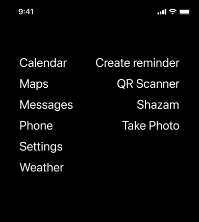
I started replacing my iOS home screen icons with verbs. "Pay" instead of opening a bank app. "Set Timer" instead of the clock.
ZenTrate is the set of Scriptable widgets that came out of it, inspired by old point-and-click adventure games.

Figma Plugins: What if using real data was simpler?
Two Figma plugins from one hack day, both fixing things that bugged me about other plugins.
Anchorify converts [text](url) and [url=url]text[/url] markup into clickable hyperlinks. Google Sheets Sync was the closest thing I'd found and it stops short of doing this.
Another plugin, Word Hugger, fixes orphaned words (those lonely single words on a line) by grouping together the last couple of words. Because every word deserves company.

ChronoMouse: What if cursors told the time?
I kept losing track of time while working, so I built ChronoMouse, a thing that shows it next to the cursor, where I'm already looking.

Spoons: What if every macOS annoyance had a fix?
I keep a folder of small things macOS does wrong, and another of the Hammerspoon scripts I write to fix them. The second folder is at github.com/sryo/Spoons.
FrameMaster. For the people who agree that the four most reachable spots on the screen shouldn't sit empty.
WindowScape. For people who want their windows to take care of themselves. Open one, the others shrink; close it, the rest fill in.
WanderFocus. For people who think hovering a window should be enough to activate it.
BubbleCursor. For when the target is small and your aim isn't. The cursor finds the nearest interactive thing and forwards clicks.
EdgeHopper. I built it for the wide displays where dragging the cursor across feels like a chore. Push against any edge and it warps to the opposite side.
SideSwipe. Puts the brightness and volume controls on the trackpad edges, for the version of you that finds the function row a small inconvenience.
Sssssssscroll. For the times you need to scroll and your hands aren't free.
Muse. For the people who switch to ChatGPT a hundred times a day. Adds AI to any input field.
DigUp. For when you remember reading something but not where. DigUp keeps a local, searchable log of every pixel you've seen.
CloudPad. For the times your phone is closer than your keyboard. CloudPad turns it into one.
HyperlinkHijacker. For the times your default browser isn't the right one.
UndoClose. For the moments right after Cmd-Q when you wish you hadn't. UndoClose brings the app back if you act within five seconds.
AutoDMG. For the people who treat a DMG download as a chore: drop it in Downloads, AutoDMG mounts, installs, and cleans up.
Palette. For the times muscle memory fails. Type a few letters and find any menu item, file, or app.
GmailTidy: What if your inbox learned from you?
For people drowning in mail. GmailTidy watches what you do, then starts doing the same.
Hot. Your inbox is for what's actually important.
Ping. Resurfaces threads you forgot to answer.
Bunch. A label per domain appears as you receive mail. For the search that ends in "from:@company.com".
Stash. For the attachment you can't find. Threads with files in their own shelf.
Riff. A draft is waiting, trained on how you write.
Public. Label an email and it becomes a blog post.
Bancor's COVID response: digitizing a bank in a week
Overview
When Argentina's branches shut in March 2020, I was leading UX at Bancor, a provincial bank that suddenly had to deliver emergency relief to people who had never had an account. The government's IFE program would pay over 600,000 residents, many of them unbanked, and the only way to reach them was through a phone.
We worked around the clock. The goal was simple: get people their money. If we failed, families wouldn't eat.
Objective
Digitize essential banking services and onboard hundreds of thousands of new users in days.
My role
I led Bancor's UX as the owner of Bancon, the home banking app. I designed the crisis features and built a new design system so that first-time digital users could actually use the platform.
What we did
Round-the-clock response
We had to rethink systems and cut anything non-essential. Years of digital progress needed to happen in a week.
Traditional onboarding was too slow. We worked with backend to create "logical accounts" for unbanked citizens without the usual paperwork. This let us open ~380,000 new accounts remotely.
I designed a feature to track credit card shipments and request delivery to a different address. Customers stuck in quarantine couldn't receive cards at their registered address.
Peperina: the design system
I proposed and convinced management to fast-track a design system called Peperina. With 15 developers shipping features simultaneously under deadline pressure, we needed a way to keep the interface consistent without constant coordination.
Peperina provided reusable components across web and mobile. Developers could grab what they needed and build. The system held up because every component was tested and documented. When someone added a new screen, it looked like it belonged.
Results
Reflection
The urgency created a kind of bond in the team. We were exhausted but focused on one thing: getting relief to people who needed it. We chose speed over rigor, with calculated risks.
Once people were forced to try digital banking, many of them kept using it. Bancor jumped ahead in digital adoption by years.
Navigating a digital transformation or crisis response? Let's talk.
HometownLocal: from web directory to service platform
Overview
I redesigned HometownLocal for the contractors and homeowners who were using it to find each other, then leaving the site to do everything else. The directory had traffic, but the connection ended at a phone number. Scheduling, communication, and billing all happened somewhere else.
We inserted ourselves into the middle. Instead of pointing users at providers and walking away, we built a platform that handled the transaction from booking through payment.
Before and after
The old directory was a dead end. Users searched, clicked a phone number, and left. Providers got leads but no tools.
The new platform stays in the loop. Booking, scheduling, messaging, and invoicing all happen in one place. We gave providers a calendar, a Kanban board for job status, and route planning. We gave customers a single thread for each job. Every completed job triggers automatic billing.
What I did
I researched pain points for providers and homeowners. Most complaints came down to the same thing: too many tools, none of them connected. We prototyped a unified flow and tested it with real providers. I worked with developers on scheduling logic and route optimization.
Results
Building a marketplace or service platform? Let's talk.
Turning a media archive into real-time tools
Overview
I joined Infoxel to find new products inside an expensive archive: 24/7 TV and radio, captured for one purpose, verifying that ads aired. The infrastructure could capture, store, and search broadcast media at scale, and most of that capability sat unused beyond the ad-verification business.
The question I came in to answer was simple: what else could come out of it?
My role
I explored new product ideas on a weekly basis, prototyping and testing concepts that used the existing data. I led the internal "hackathon" sessions that produced our new product suite.
What we built
Vlic: real-time news monitoring
PR teams were learning about crises hours after they aired. Traditional monitoring was too slow.
We started with web dashboards, but they weren't immediate enough. User interviews pointed us toward mobile push notifications. The final app pinged users the instant their keyword was mentioned on TV or radio, so they could react while the story was still developing.
Welo: live TV clipping
Newsrooms waited on engineers to pull footage. By the time they got clips, the window for social sharing had closed.
We built a live DVR interface. Users dragged handles on a timeline to mark start and end points, then exported clips to share. Server-side processing kept the phone-side experience fast. Weekly sessions with journalists helped us cut export time to seconds.
Results
Weekly prototyping sessions let us move from idea to test in days. We dropped features that did not work and doubled down on the ones that did. The approach became the company's standard for trying new ideas.
Need to modernize a legacy product or establish an innovation process? Let's talk.
La Voz del Interior: Building a paywall for a 115-year-old newspaper
Overview
I worked on the digital strategy for La Voz del Interior, a 115-year-old Argentine paper trying to convince readers to pay for news online while print revenue fell. Online readership was growing, but print advertising had dropped by 40%, and digital had to become the primary revenue source against an audience that expected news to be free.
Other papers were hesitant to add paywalls. We tried anyway.
Build decision
We built our own paywall platform, Wyleex.
The core components:
- Metering logic that tracks article consumption per user
- Content tiers separating free, premium, and exclusive stories
- Subscription management integrated with local payment processors
Building in-house meant we controlled the pricing model. We could offer peso-denominated subscriptions and adjust tiers based on what Argentine readers would actually pay.
Mobile-first storytelling
Younger readers were on Instagram and WhatsApp, not reading long broadsheets. We had to meet them where they were.
- Visual storytelling: I shifted the approach from text-heavy articles to "snackable" content, rich with photos, videos, and infographics optimized for thumb-scrolling.
- Clean design: We rolled out a minimalist interface that put content first, removing the clutter that drove mobile users away.
Results
In February 2018, the paywall went live.
This project required convincing a newsroom steeped in tradition to tell stories differently. The paywall worked. We later offered Wyleex as a service to other publishers in Latin America.
Reinventing content or editorial workflows? Let's talk.
OMSNIC: Consolidating 112 insurance forms into one
Overview
I designed for oral and maxillofacial surgeons buying liability insurance, people whose time is billed in surgical hours, not paperwork. The existing process made them fill out 112 different forms, and they dropped off constantly.
Progressive disclosure
We replaced the wall with a conversation. One question at a time.
The system validates each answer before moving forward. If a surgeon enters an invalid license number, they see the error immediately, not after submitting 30 fields. This keeps context tight and reduces cognitive load.
Branching logic stays invisible
Different states require different coverage types. A surgeon in California sees questions about earthquake liability. One in Florida sees hurricane-related questions. The branching happens behind the scenes. Users only see questions relevant to their situation.
We tested prototypes with surgeons early. Their feedback shaped the language to match how they think about their practice, not how the insurance database is structured.
Results
The process that took hours now takes minutes.
Simplifying complex forms or insurance workflows? Let's talk.
TopicFlower: From visualization to analytics platform
Overview
I redesigned TopicFlower for social media managers who had to prove ROI, not just show their clients a nice visualization. The original product displayed topics as a flower, each petal sized by engagement. Clients liked the visual, but "that's cool" doesn't renew contracts.
As the market matured, brands wanted numbers they could act on. The flower was a conversation starter. Data-driven teams needed more.
Objective
Transform a visual novelty into an analytics platform without losing the identity that made TopicFlower distinctive.
My role
I redesigned the app's usability and product strategy. The task was to connect the visual model to the hard data that social media managers needed to prove ROI.
The shift from art to analytics
Early TopicFlower was all form, little function. Users struggled to extract concrete numbers from the flower model.
The redesign introduced a dashboard that prioritized metrics. We answered the "Who, What, When, Where" of engagement immediately. The flower became a supporting visual rather than the only interface.
We added a content calendar and scheduling tools. This shifted the platform from a place you checked to a place you worked. We also built competitive benchmarking to compare performance against competitors, turning interaction data into strategic guidance.
Tech and implementation
Upgrading from a visual tool to a platform required a major overhaul. We used the Nebular Design System (Angular) to build a consistent interface. I worked closely with developers to make the new data visualizations performant and responsive.
Reflection
The flower still works as a hook, but now there's real analysis underneath it. Teams can act on the data, not just admire it.
Turning data visualization into actionable insights? Let's talk.
VENG: an e-commerce platform for satellite imagery
Overview
I designed for the researchers, agronomists, and analysts who needed SAOCOM satellite imagery but had to go through agencies and paperwork to get it. SAOCOM is an Argentine constellation that captures Earth imagery around the clock in any weather, and most of the people who could use it never saw it.
We built an e-commerce platform to change that. Users browse a map, filter by date and resolution, preview images, and pay online. For areas not in the catalog, they submit a tasking request for new captures.
What we shipped
This was a working product, not a prototype. Users could:
- Search an archive by location, date, and cloud cover
- Preview low-resolution imagery before purchase
- Buy and download high-resolution files
- Request new satellite passes for custom areas
I worked with the VENG team to understand the satellites' technical constraints and translated those into interface decisions. SAR imagery is unfamiliar to most users, so the design leaned on familiar e-commerce patterns: search, preview, add to cart, checkout.
Results
Working on geospatial products or complex data platforms? Let's talk.